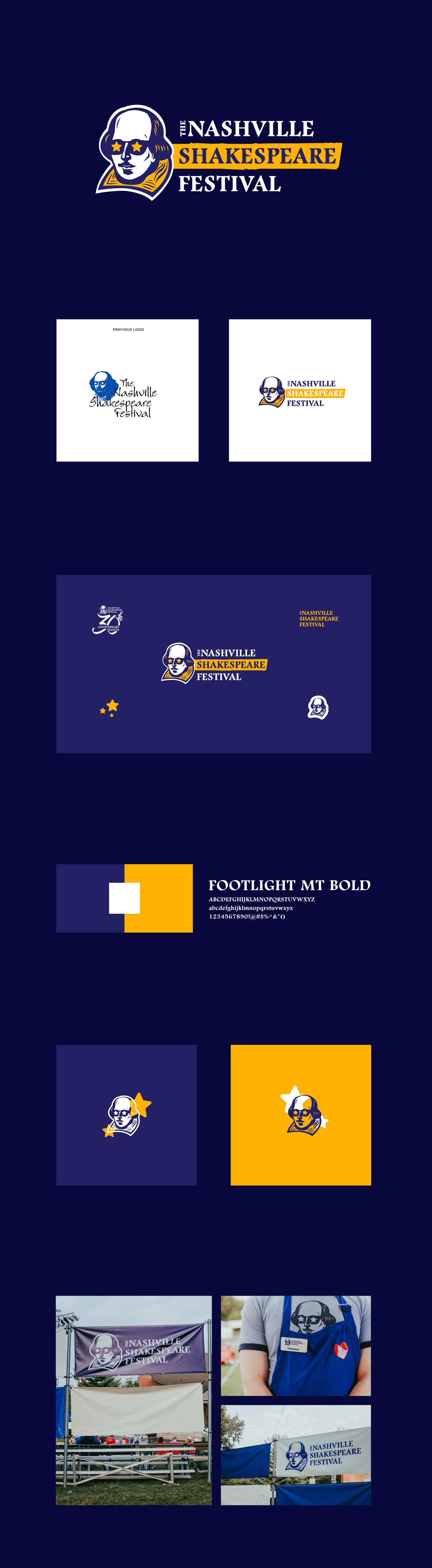
Nashville Shakespeare Festival
a facelift for a beloved nashville brand.
The Nashville Shakespeare Festival is a closely held performing arts company, with a highly attended Shakespeare in the Park series during summer. Their original logo had a tremendous amount of brand recognition, but was dated and difficult to reproduce.
Keeping the bard’s sunglasses was a nod to the history of the brand, as well as the royal blue. A printmaking-esque mark treatment and a historic typeface help to highlight the time period of Shakespeare.
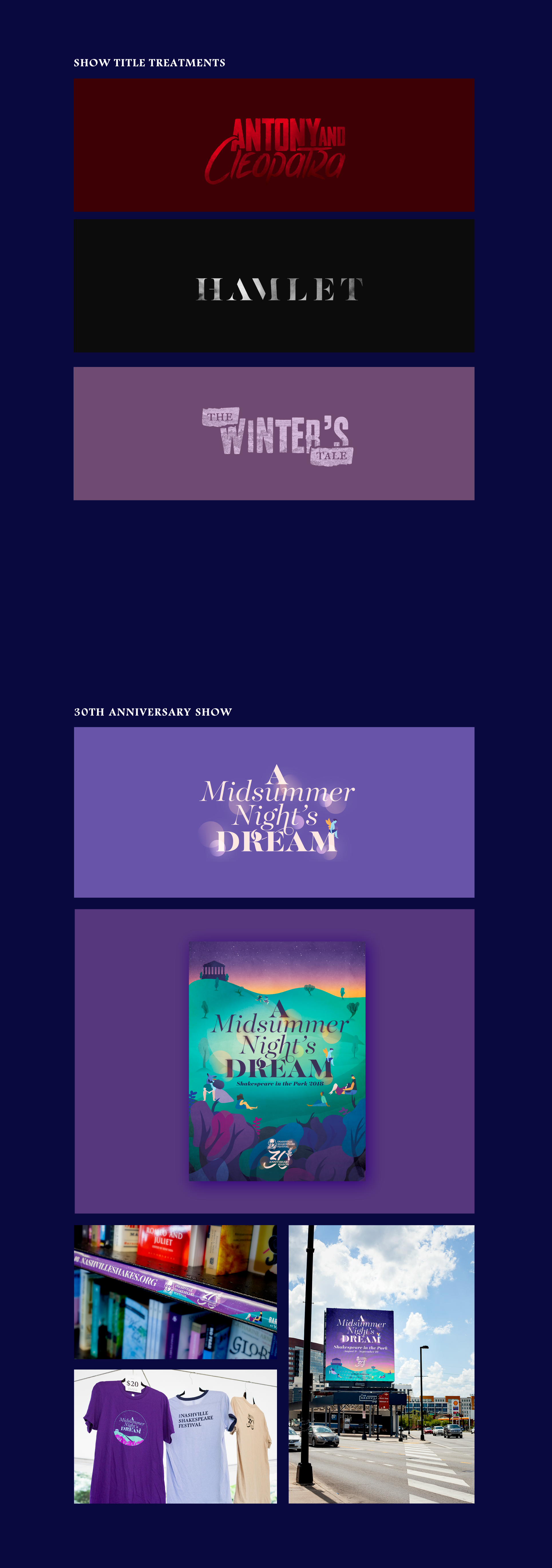
For NSF’s 30th anniversary season, they needed something special and celebratory. They settled on performing a crowd-pleaser, A Midsummer Night’s Dream, and promoted the show all over town.